 MC-132651
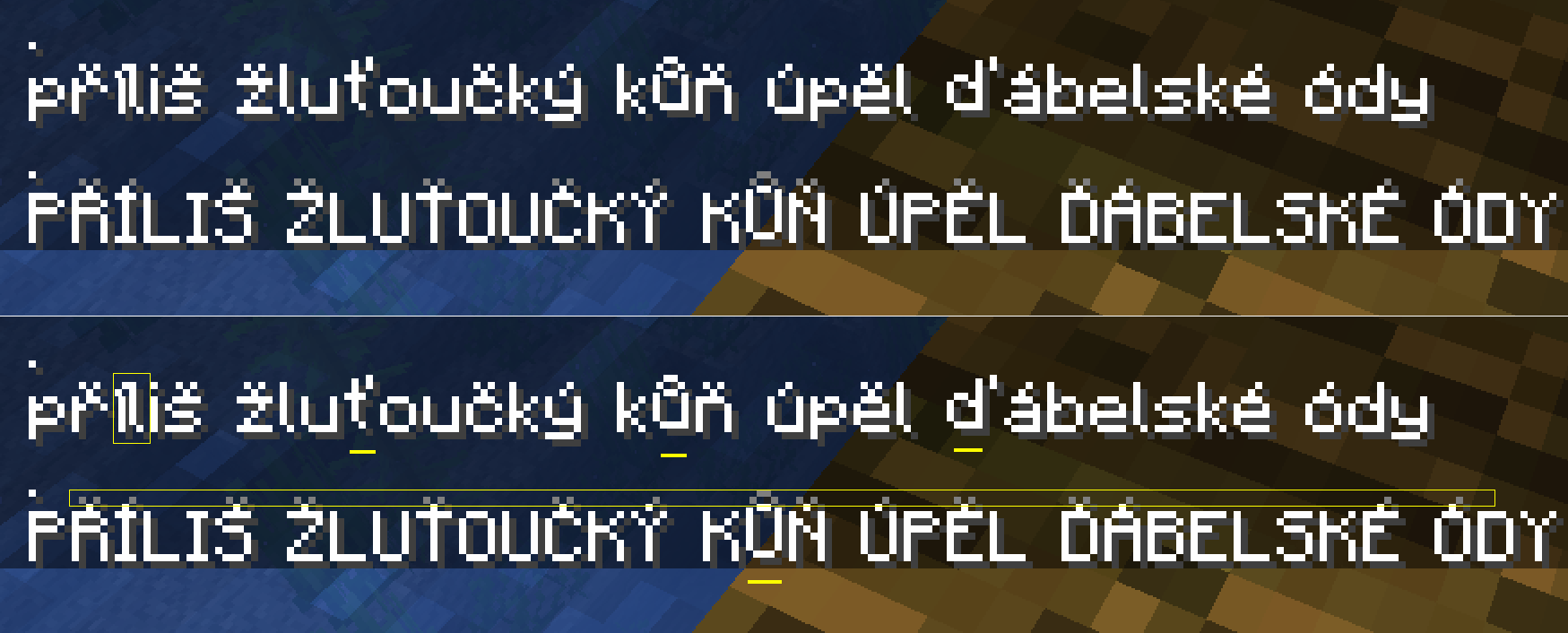
New font: Leviated characters ů ť ď Ů, darker upper pixel, too thin í
New font with diacritics is almost OK, thanks a lot.
- Only the Czech letters "ů", "ť", "ď" and "Ů" a little levitate.
- The upper pixels are darker (grey).
- Letter "í" is too thin and diacritic touches the next letter.
But I am really very glad that all letters look the same.
Edit (20180706): Slovak letter "ľ" levitates too. See the third character on the picture, where are letters "lĺľł".
Environment
win7, java 8u171
Linked Issues
 Low
Low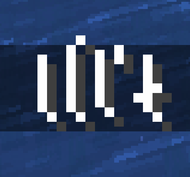

Created Issue:
New font is almost OK
New font with diacritics is almost OK, thanks a lot.
- Only the Czech letters "ů", "ť", "ď" and "Ů" a little levitate.
- The upper pixels are darker (grey).
- Letter "í" is too thin and diacritic touches the next letter.
But I am really very glad that all letters looks the same.
Environment
win7, java 8u171
Attachments3
image-2018-07-04-16-54-02-191.png
New font with diacritics is almost OK, thanks a lot.
- Only the Czech letters "ů", "ť", "ď" and "Ů" a little levitate.
- The upper pixels are darker (grey).
- Letter "í" is too thin and diacritic touches the next letter.
But I am really very glad that all letters look
sthe same.
![[Mod] NeunEinser](../../../data/avatars/users/39263.png)
![[Mod] Neko](../../../data/avatars/users/92901.png)
New font is almost OKIssues with new font

New font with diacritics is almost OK, thanks a lot.
- Only the Czech letters "ů", "ť", "ď" and "Ů" a little levitate.
- The upper pixels are darker (grey).
- Letter "í" is too thin and diacritic touches the next letter.
But I am really very glad that all letters look the same.
New font with diacritics is almost OK, thanks a lot.
- Only the Czech letters "ů", "ť", "ď" and "Ů" a little levitate.
- The upper pixels are darker (grey).
- Letter "í" is too thin and diacritic touches the next letter.
But I am really very glad that all letters look the same.
Issues with new fontNew font: Leviated characters, darker upper pixel, etc
New font: Leviated characters ů ť ď Ů, darker upper pixel, etc
New font: Leviated characters ů ť ď Ů, darker upper pixel,etcNew font: Leviated characters ů ť ď Ů, darker upper pixel, too thin í
relates to
New font with diacritics is almost OK, thanks a lot.
- Only the Czech letters "ů", "ť", "ď" and "Ů" a little levitate.
- The upper pixels are darker (grey).
- Letter "í" is too thin and diacritic touches the next letter.
But I am really very glad that all letters look the same.
New font with diacritics is almost OK, thanks a lot.
- Only the Czech letters "ů", "ť", "ď" and "Ů" a little levitate.
- The upper pixels are darker (grey).
- Letter "í" is too thin and diacritic touches the next letter.
But I am really very glad that all letters look the same.
Edit (20180706): Slovak letter "ľ" levitates too. See the third character on the picture, where are letters "lĺľł".
![[Mojang] Grum (Erik Broes)](../../../data/assets/gravatar/grum.png) [Mojang] Grum (Erik Broes)
[Mojang] Grum (Erik Broes)relates to
Rows are lower than capital letters with diacritical marks. When we have several lines of text, the diacritics are overlapped by adjacent lines. This applies to the diacritics above the letters (Č, Ť, Ô, Ŕ, Ś, Ź, Ä, Ö, Ü, ...) and bellow the letters (Ą, Ę, Ç, ...).
Relates: MC-132651