 MC-132639
New version of unicode font has some weird characters
Linked Issues
![[Mod] Urielsalis](../../../data/assets/gravatar/urielsalis.jpeg)


Created Issue:
New version of unicode font has some weird characters
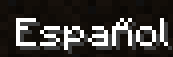
Examples attached, some of the letters dont look like it should(like the ñ), or are not clear differentiated from others(like the ß)
Attachments2
![[Mod] NeunEinser](../../../data/avatars/users/39263.png)
![[Mod] Michael Wobst](../../../data/avatars/users/37868.png)
image-2018-07-05-01-35-05-048.png

relates to
![[Mod] Neko](../../../data/avatars/users/92901.png)
is duplicated by
is duplicated by
![[Mod] violine1101](../../../data/avatars/users/92858.png)
relates to

![[Mojang] Grum (Erik Broes)](../../../data/assets/gravatar/grum.png) [Mojang] Grum (Erik Broes)
[Mojang] Grum (Erik Broes)

No, Matthew, it's certainly not a dublicate. MC-132639 reports some really bad shapes of some characters, while this is a direct effect of MC-132736 seen in the vanilla font. It's a subtle, but valid issue. The problem is that the tail of the capital ß shows a tiny deviation from the vanilla 7x5 pixel shape, causing a visible artifact. Added a zoomed-in version of the image provided by FlubberFrosch where the artifact is better visible and a screenshot of the letter outline displayed in Fontforge, where the problem is clearly visible too. Should be an easy fix for Mojang, just two vector points to move a bit to the right ...
Exactly, the letter ñ has to accents which are not correct, seems like they changed all the "accents" to à and á.
Not a translation issue.
The ß does not only look like an A that drank a little over its limits, but it's also entirely incorrect and German speakers would not necessarily recognise it as a ß. Apart from that, it's just ugly. The ẞ is fine though.
Also, imho characters with diacritics would look better if the diacritics didn't stick to the letter, but would float above them.
For the ñ, I'm sad that the straight line is gone. It just looked so much better than the current double accent.
I like the Capital ẞ, but the lower ß looks very weird. For German speakers it would look way better this way and more readable. (before -> after)
I think 4 pixels is a bit too narrow for this font. Here's my version (capital – small):

Capital T with comma below looks like an elongated normal T, the comma is not distinguishable. I attached a version that I think looks better (before -> after).