 MC-256883
Elements within the game menu are now positioned slightly lower than they were in previous versions
The Bug:
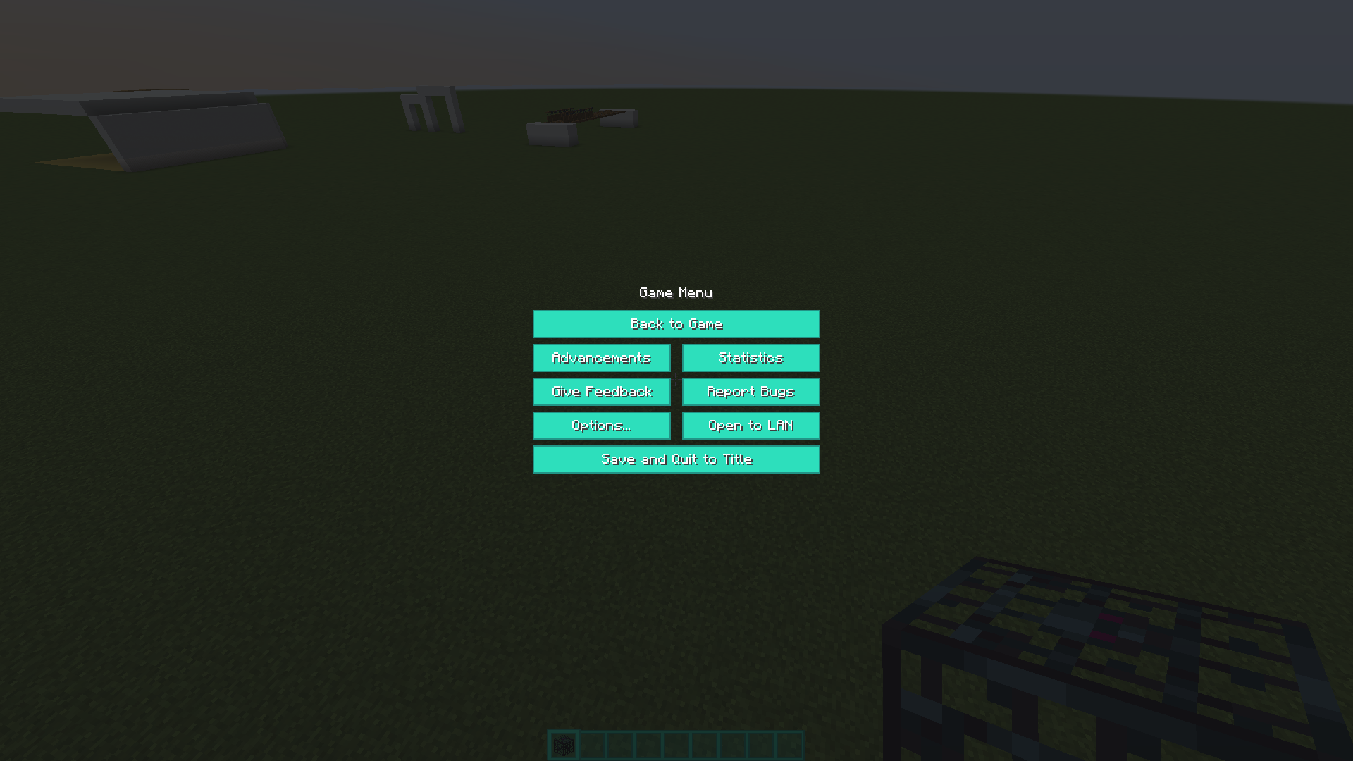
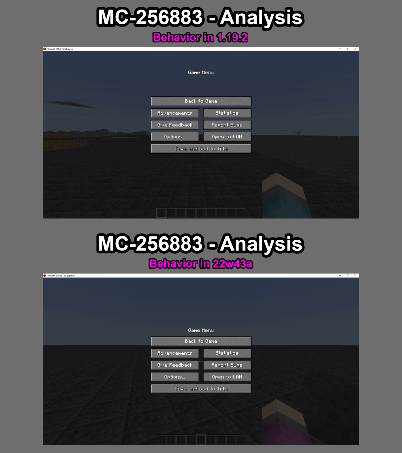
Elements within the game menu are now positioned slightly lower than they were in previous versions.
This could be an intentional change but it wasn't mentioned in the changelog so I'm just making a report just in case. For a visual understanding of the potential issue here, see the two screenshots I've attached below that show the difference in behavior between versions.
MC-256883 - Behavior in 1.19.2.png
MC-256883 - Behavior in 22w43a.png
Steps to Reproduce:
- Join a singleplayer world and hit the ESC key.
- Look at the positioning of the elements within the game menu.
- Take note as to whether or not elements within the game menu are now positioned slightly lower than they were in previous versions.
Observed Behavior:
Elements within the game menu are now positioned slightly lower than they were in previous versions.
Expected Behavior:
Elements within the game menu would be positioned the same way as they were in previous versions.
Linked Issues
Attachments9


![[Mod] Avoma](../../../data/avatars/users/86198.png)


 Important
Created Issue:
The game menu is now positioned lower down than is used to be
The game menu is now positioned lower down than is used to be
The game menu is now positioned lower down than is used to be.
This could be an intentional change but it wasn't mentioned in the changelogs so I'm just making a report just in case.
![[Mod] ampolive](../../../data/avatars/users/18949.svg)
The game menuisnow positionedlower down than is used to be.
This could be an intentional change but it wasn't mentionedinthechangelogs so I'm just making a report just in case.The Bug:
Elements within the game menu are now positioned slightly lower than they were in previous versions.
This could be an intentional change but it wasn't mentioned in the changelog so I'm just making a report just in case.
Steps to Reproduce:
- Join a singleplayer world and hit the ESC key.
- Look at the positioning of the elements within the game menu.
- Take note as to whether or not elements within the game menu are now positioned slightly lower than they were in previous versions.
Observed Behavior:
Elements within the game menu are now positioned slightly lower than they were in previous versions.
Expected Behavior:
Elements within the game menu would be positioned the same way as they were in previous versions.
The Bug:
Elements within the game menu are now positioned slightly lower than they were in previous versions.
This could be an intentional change but it wasn't mentioned in the changelog so I'm just making a report just in case. For a visual understanding of the potential issue here, see the two screenshots I've attached below that show the difference in behavior between versions.
MC-256883 - Behavior in 1.19.2.png
MC-256883 - Behavior in 22w43a.pngSteps to Reproduce:
- Join a singleplayer world and hit the ESC key.
- Look at the positioning of the elements within the game menu.
- Take note as to whether or not elements within the game menu are now positioned slightly lower than they were in previous versions.
Observed Behavior:
Elements within the game menu are now positioned slightly lower than they were in previous versions.
Expected Behavior:
Elements within the game menu would be positioned the same way as they were in previous versions.
The game menuisnow positionedlower down than is used to beElements within the game menu are now positioned slightly lower than they were in previous versions
is duplicated by
![[Mod] Michael Wobst](../../../data/avatars/users/37868.png)
is duplicated by
image-2022-11-09-15-11-35-421.png
is duplicated by
is duplicated by
![[Mojang] Felix Jones](../../../data/avatars/users/40484.png) [Mojang] Felix Jones
[Mojang] Felix Jones![[Bot] Piston](../../../data/avatars/users/31202.png)
Thank you for your report!
We're tracking this issue in MC-256883, so this ticket is being resolved and linked as a duplicate.
If you would like to add a vote and any extra information to the main ticket it would be appreciated.
If you haven't already, you might like to make use of the search feature to see if the issue has already been mentioned.
Quick Links:
📓 Bug Tracker Guidelines – 💬 Community Support – 📧 Mojang Support
📓 Project Summary – ✍️ Feedback and Suggestions – 📖 Game Wiki

Duplicate of MC-256883.
![[Bot] Arisa](../../../data/avatars/users/43007.png)
Thank you for your report!
We're tracking this issue in MC-256883, so this ticket is being resolved and linked as a duplicate.
If you would like to add a vote and any extra information to the main ticket it would be appreciated.
If you haven't already, you might like to make use of the search feature to see if the issue has already been mentioned.
Quick Links:
📓 Bug Tracker Guidelines – 💬 Community Support – 📧 Mojang Support
📓 Project Summary – ✍️ Feedback and Suggestions – 📖 Game Wiki
– I am a bot. This action was performed automatically! The ticket was resolved by one of our moderators, and I left this message to give more information to you.

Thank you for your report!
We're tracking this issue in MC-256883, so this ticket is being resolved and linked as a duplicate.
If you would like to add a vote and any extra information to the main ticket it would be appreciated.
If you haven't already, you might like to make use of the search feature to see if the issue has already been mentioned.
Quick Links:
📓 Bug Tracker Guidelines – 💬 Community Support – 📧 Mojang Support
📓 Project Summary – ✍️ Feedback and Suggestions – 📖 Game Wiki
– I am a bot. This action was performed automatically! The ticket was resolved by one of our moderators, and I left this message to give more information to you.
Thank you for your report!
We're tracking this issue in MC-256883, so this ticket is being resolved and linked as a duplicate.
If you would like to add a vote and any extra information to the main ticket it would be appreciated.
If you haven't already, you might like to make use of the search feature to see if the issue has already been mentioned.
Quick Links:
📓 Bug Tracker Guidelines – 💬 Community Support – 📧 Mojang Support
📓 Project Summary – ✍️ Feedback and Suggestions – 📖 Game Wiki
Can confirm.
Please don't delete my comments. This change should be reverted, something simillar happened in 1.17 when they switched around the creative mode/hardcore buttons on the world creation screen, it was annoying and no one liked it so they reverted it. There's no reason to conflict with 9 years of muscle memory.
When I first opened the new Minecraft version, the pause menu immediately felt off. I think the problem is that it's too centered. In contrast, other menus are a bit higher on the screen. Unlike the inventory menus, the header text doesn't have a background, so visually it has less weight to it, making the pause menu feel even more down then it really is.
I don't have a problem with this new, more-centered menu, but it should be centered visually, not only "in code". Having it centered on the buttons (ignoring the header text for layout) would be a welcome improvement.